
How do you stand out in a sea of red and blue?
You let judgment—not decoration—lead.
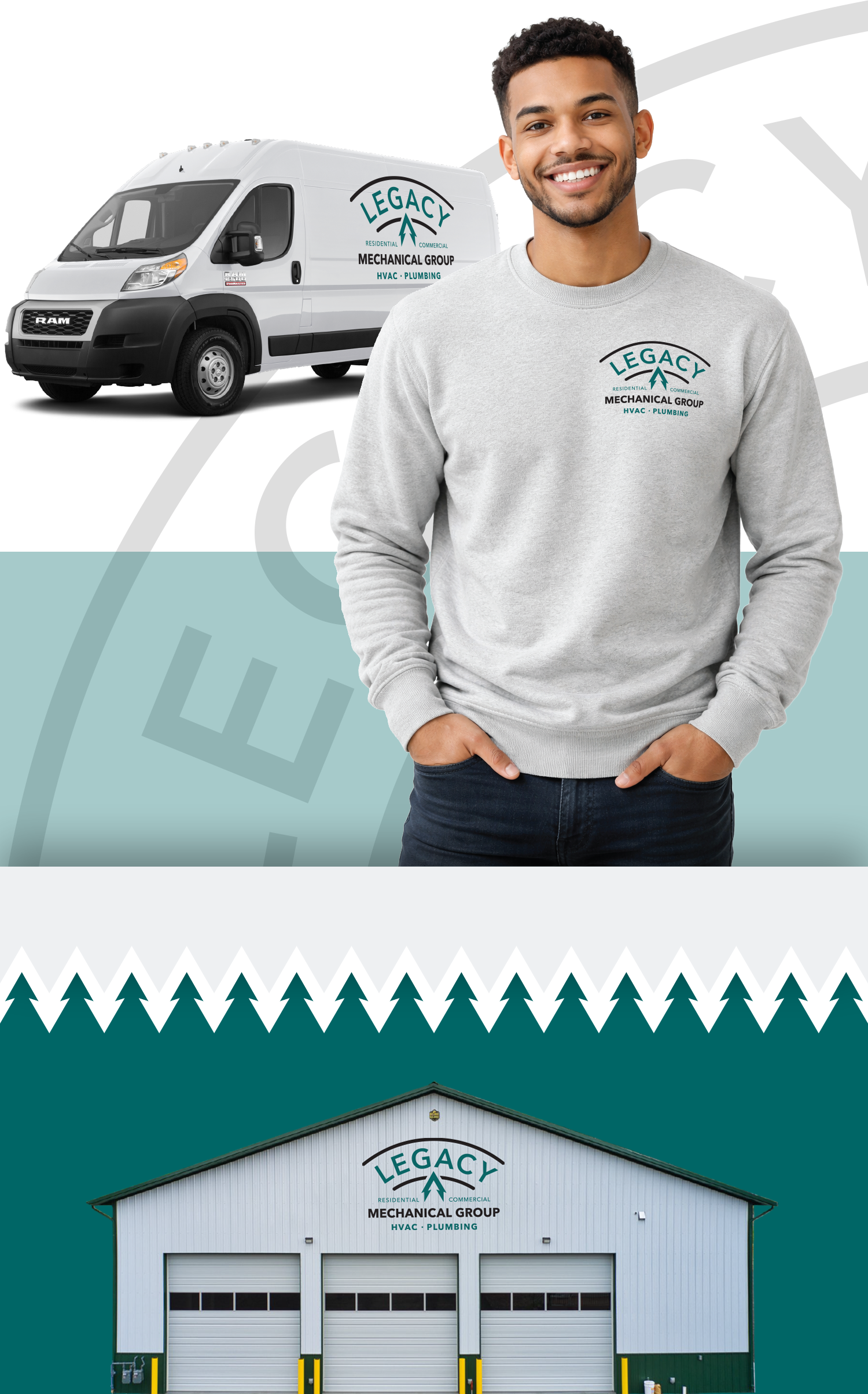
A newly launched mechanical services company entered a market dominated by look-alike branding and short-term promotional thinking. The owner wanted a brand that communicated professionalism, quality, and permanence—something designed to grow with the business and endure over time.
The challenge was translating that ambition into a clear visual system. Evergreen tones and a tree—important to the owner’s vision of “Legacy”—risked signaling landscaping rather than HVAC if handled too literally.
The solution was a restrained, strategy-led identity that prioritized clarity at a glance. Visual guardrails ensured the brand felt confident and credible within its category, while the tree was subtly embedded in the negative space of the mark—present by intent, but not overstated.
To give that hidden element shared meaning, I also proposed a narrative-based activation that connected the brand to Maryland’s Department of Natural Resources environmental gift program. The idea gave the owner a simple, authentic way to explain the brand’s values to a local audience rooted in land, tradition, and long-term stewardship—without turning purpose into promotion.
The brand is now deployed across trucks, uniforms, signage, and storefronts.
• A commodity service
• A clear point of view
• A brand designed to last
…
ROLES:
Brand Strategy & Creative Direction
Identity System Development
Senior Stakeholder Advisory